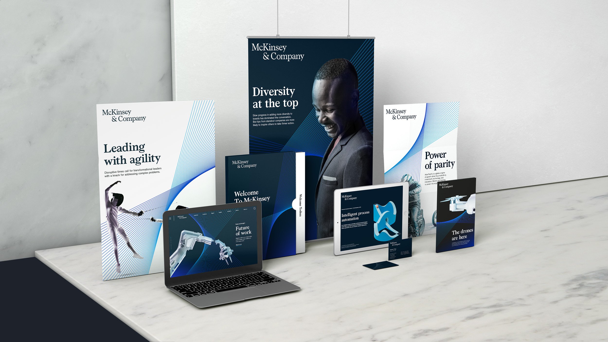
McKINSEY & COMPANY
A high-contrast identity for a consulting industry giant that visually embodies clarity of thought, expertise, and the profound impact McKinsey has on our constantly evolving world.
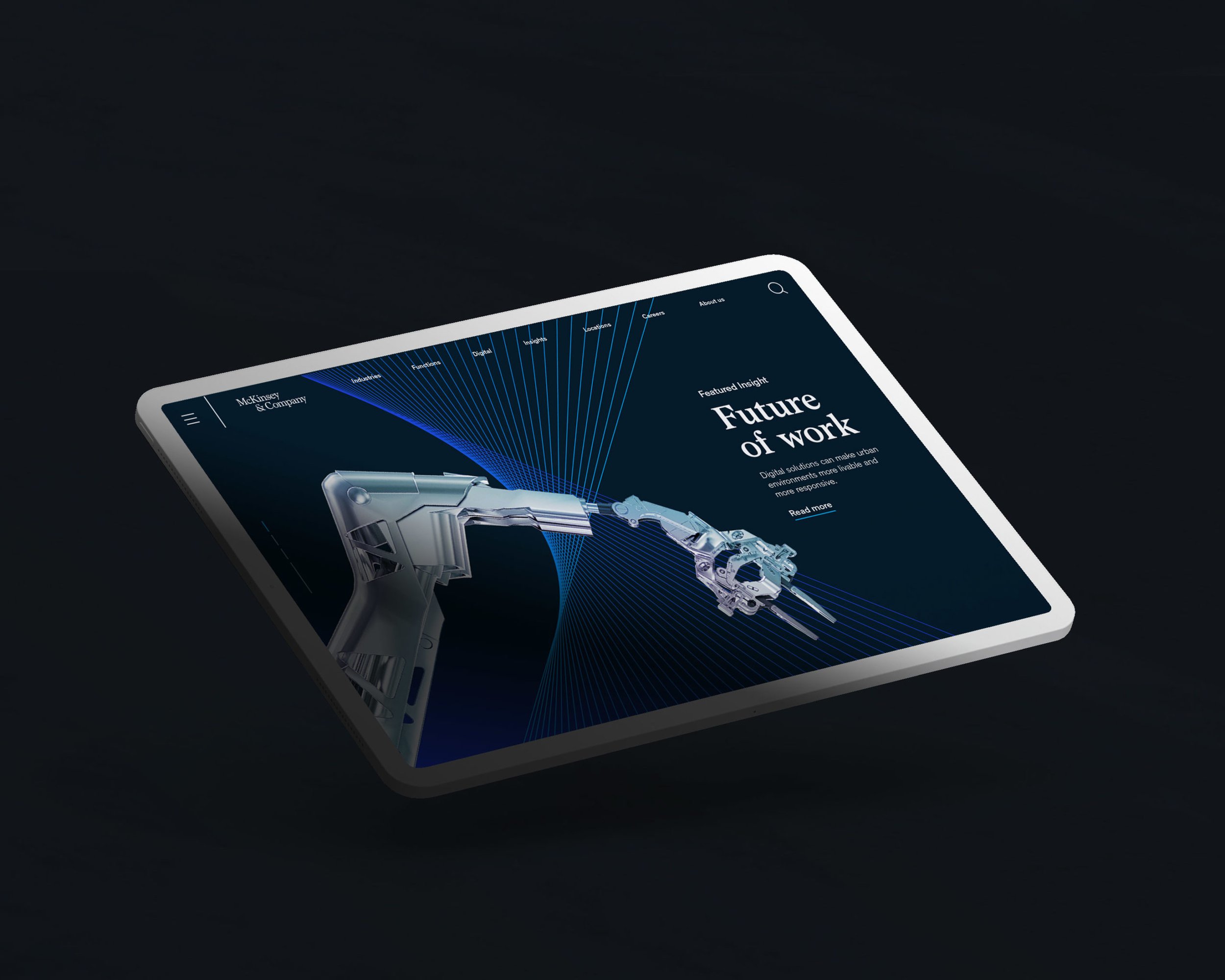
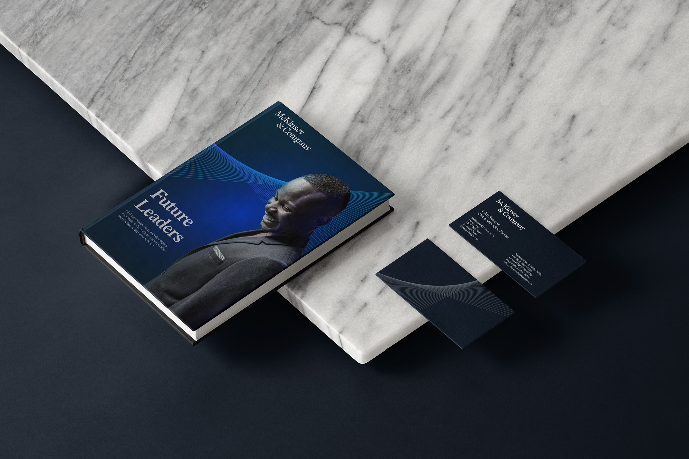
A new suite of dynamic elements form the heart of the new identity.
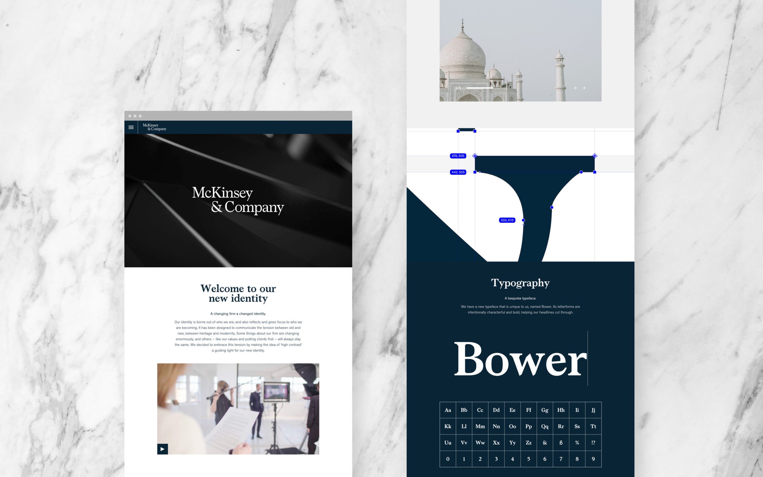
The ‘Partnership Mark’ sits at its core – always in perpetual motion, symbolising the agile ways McKinsey work with clients. The new script mark, an evolution of the historic serif logo, was redesigned with a modern character. The brand remains blue – but a new ‘McKinsey blue’, contrasted against a clean white, helping to cut through the visual noise of the every day. A new bespoke typeface and custom photographic style ensure an ownable fidelity across all touchpoints both physical and digital.